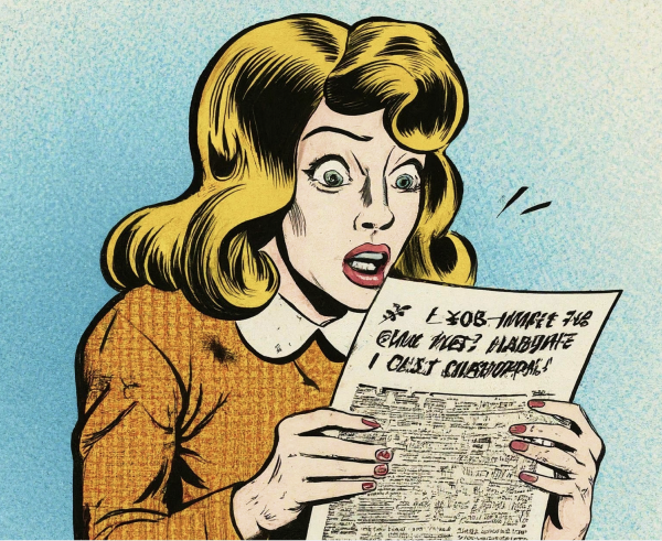
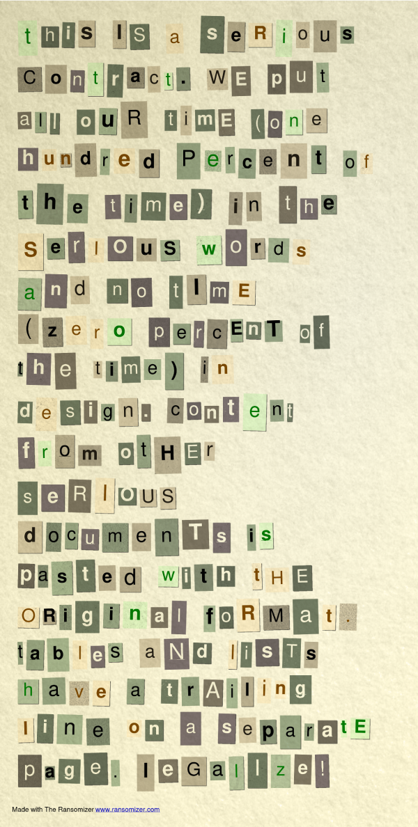
Is it just me, or are all contracts really getting uglier and harder to read?
I’ve decided to offer expert document design services for legal agreements, technical documentation and other long form documents.
⌘
Before and After
TBD
⌘
FAQs
⌘

My first design job was as a DTP designer at a local newspaper. I wanted to be good at it, and I happened to like it, so I quickly became obsessed with typography, legibility, and page design in general. Since then, up to this day, before I read a page, I will first assess its layout, font choices, spacing, alignment, kerning, wrapping, etc. Books, ebooks, websites, restaurant menus, brochures, fliers, emails, contracts. Silently judging.
There are good and bad page designs.
Most books are well designed, but many ebooks are not. Most magazines and newspapers are very well designed, and sometimes their websites are too.
Yet, almost all legal documents are very, truly bad.
It doesn’t have to be like this.
